
matplotlibはpythonでグラフを描写するライブラリです。
データ同士の関係、変数同士の関係を可視化するために使われます。
本記事のコードは全てグーグルコラボラトリーで記述・動作を確認しています。
グーグルコラボラトリーとはgoogleアカウントを持っている人であれば、誰でも・無料で使うことができるpythonの対話型実行環境です。
データ分析に必要なライブラリが初めから搭載されていて、環境構築の必要がないため、python初心者には特にオススメです!
matplotlibを使ってpythonでグラフを描く

matplotlibではさまざまなグラフを描くことが可能です。(グラフのタイプ_matplotlib公式)
今回はその中から、よく使われる以下のグラフについて紹介します。
matplotlibを使うための準備

matplotlibを使用するには、ライブラリのインストールおよびインポートが必要です。
Googleコラボラトリーを使用している場合、インストールの作業は必要ありません。
今回は以下のライブラリを使用します。
- pandas: データ整理のためのライブラリ
- matplotlib: グラフ描画ライブラリ 今回はグラフを書くモジュールpyplotを使用
また%matplotlib inline と記述してください。
これはマジックコマンド言います。
jupyterやgoogleコラボラトリーのような対話式環境でグラフを表示させるには、%matplotlib inlineの記述が必要です。
import pandas as pd
import matplotlib.pyplot as plt

%matplotlib inline
maplotlibで折れ線グラフを描く

折れ線グラフは時系列による変化を可視化するときによく使われるグラフです。
今回は1週間の最高気温を折れ線グラフにしてみます。
折れ線グラフにするデータを用意します。
今回はpandasのデータセットで作成します。
air_tmp = pd.DataFrame({'week': ['mon', 'tue', 'wed', 'thu', 'fri', 'sat', 'sun'],
                          'max': [10, 13, 15, 15, 16, 15, 10]})
air_tmp
出力:
| index | week | max | min |
|---|---|---|---|
| 0 | mon | 10 | 7 |
| 1 | tue | 13 | 10 |
| 2 | wed | 15 | 9 |
| 3 | thu | 15 | 5 |
| 4 | fri | 16 | 5 |
| 5 | sat | 15 | 7 |
| 6 | sun | 10 | 8 |
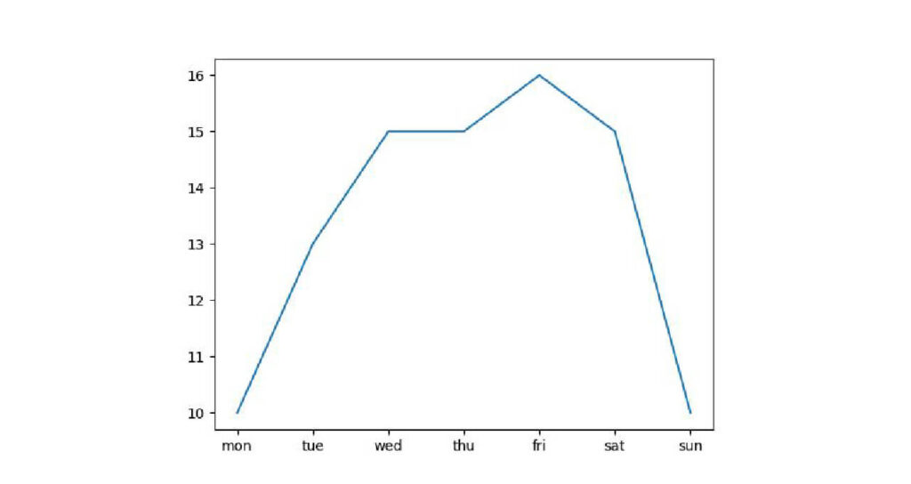
折れ線グラフはmatplotlib.pyplot.plot(x,y)です。
今回はインポートの段階で、matplotlib.pyplotをpltと省略しているので、plt.plotと記述します。
データフレームの特定の列を指定して使うにはスライスが便利です。データセット名[‘列名’]で使用できます。
plt.plot(air_tmp['week'], air_tmp['max'])

plt.show()
出力:
各グラフは引数を指定することで、グラフの見た目をデザインすることが可能です。
plt.plot()で変更できる引数をいくつか紹介します。
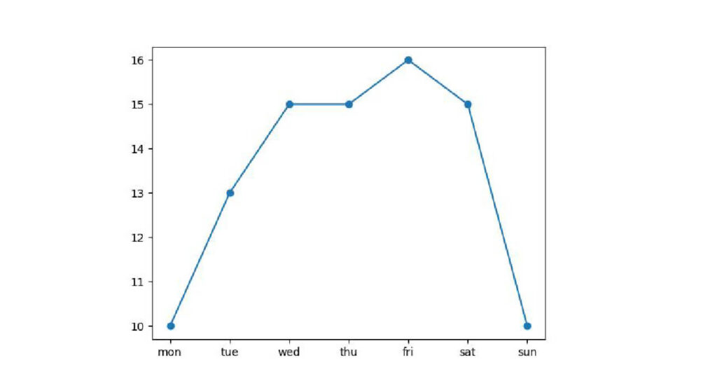
マーカーの表示
マーカーの表示は、plt.plot()の引数makerを使います。
使えるマーカーはmatplotlib.markersを参照してください。
plt.plot(air_tmp['week'], air_tmp['max'], marker='o')

plt.show()
出力:
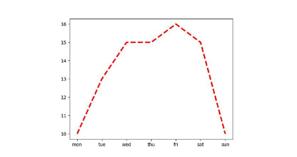
折れ線の太さ・スタイル・色を変える
折れ線の太さは引数linewirth, 破線や点線などのスタイルは引数linestyle, 色は引数colorで変更します。
スタイルは‘solid’ (実線), ‘dashed’ (破線), ‘dashdot’ (破線&点線), ‘dotted’ (点線) から指定可能です。
plt.plot(air_tmp['week'], air_tmp['max'], linewidth=3, linestyle='dashed', color='red' )

plt.show()
出力:
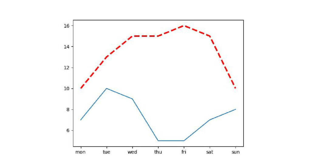
1つのグラフに複数の折れ線を表示する
1つのグラフに複数の折れ線グラフを表示させるには、1つのコード内で2つのplt.plotを記述すればOKです。
まずはデータを追加します。
air_tempに[‘min’]という列名を作り、indexと同じ数のデータを指定することで追加可能です。
air_tmp['min'] = [7, 10, 9, 5, 5, 7, 8]
air_tmp
出力:
| index | week | max | min |
|---|---|---|---|
| 0 | mon | 10 | 7 |
| 1 | tue | 13 | 10 |
| 2 | wed | 15 | 9 |
| 3 | thu | 15 | 5 |
| 4 | fri | 16 | 5 |
| 5 | sat | 15 | 7 |
| 6 | sun | 10 | 8 |
最高気温と最低気温の折線を一つのグラフに書いてみましょう。
plt.plot(air_tmp['week'], air_tmp['max'],
      linewidth=3, linestyle='dashed', color='red' )
plt.plot(air_tmp['week'], air_tmp['min'] )

plt.show()
出力:
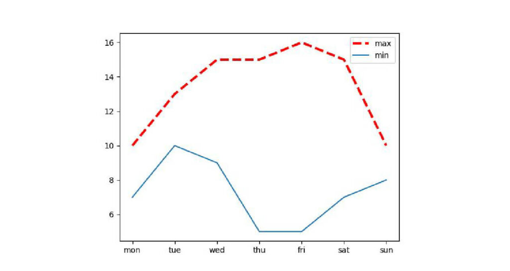
凡例を追加する
先ほどのグラフは青いグラフが最低気温、赤いグラフが最高気温ですが、説明がないと分かりませんね。
凡例をつけて分かるようにします。
凡例は引数labelで追加しますが、これだけでは凡例が表示されません。
凡例が表示されるようにmatplotlib.pyplot.legend()関数を記述します。
plt.plot(air_tmp['week'], air_tmp['max'],
      label='max', linewidth=3, linestyle='dashed', color='red' )
plt.plot(air_tmp['week'], air_tmp['min'], label='min' )
plt.legend()

plt.show()
出力:

作成したグラフを画像として保存する
グラフの保存はmatplotmib.pyplot.savefig(‘ファイル名.拡張子’)関数で実行可能です。
もしGoogleコラボラトリーで作業している人は、plt.savefig(‘保存したいディレクトリのパス/ファイル名.拡張子’)と記述してください。
この際google driveと同期して、ドライブ内に保存すると分かりやすいです。
また、plt.savefig()はplt.show()よりも前に記述する必要があります。
plt.plot(air_tmp['week'], air_tmp['max'], label='max', linewidth=3, linestyle='dashed', color='red' )
plt.plot(air_tmp['week'], air_tmp['min'], label='min' )
plt.savefig('保存したいディレクトリのパス/air_tmp.png')
plt.legend()

plt.show()
出力:
棒グラフをmatplotlibで描写

棒グラフはそれぞれの値を比較するときに用いられるグラフです。
以下の手順でmatplotlibで棒グラフを描きます。
棒グラフにするデータを用意します。
今回はA~Dさんの数学のテストの点数というデータです。
point = pd.DataFrame({'name': ['A', 'B', 'C', 'D'],
                        'math': [50, 40, 80, 60]})

point.head()
出力:
| index | name | math |
|---|---|---|
| 0 | A | 50 |
| 1 | B | 40 |
| 2 | C | 80 |
| 3 | D | 60 |
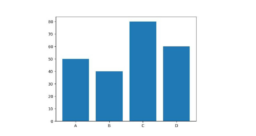
用意したpointデータフレームを棒グラフで表示します。
棒グラフはmatplotlib.pyplot.bar(x,y)です。
plt.bar(point['name'], point['math'])

plt.show()
出力:

参照するデータがデータフレームの場合、plt.bar(xのカラム名, yのカラム名, data=データフレーム名)でも表示できます。
plt.bar('name', 'math', data=point)

plt.show()
出力:
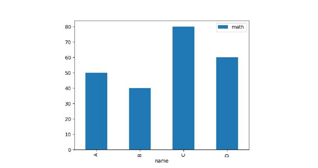
また、pandasの組み込み関数plotを使用しても描写可能です。
point.plot('name', 'math', kind='bar')

plt.show()
出力:
積み上げ棒グラフを作成する
積み上げ棒グラフは以下の手順で記述します。
まず、積み上げるデータを用意しましょう。
データフレームにA~Dさんの国語の点数を追加します。
データフレームで存在しないカラム名を指定すると、新しい列を追加可能です。
point['jap'] = [30, 100, 70, 50]
point.head()
出力:
| index | name | math | jap |
|---|---|---|---|
| 0 | A | 50 | 30 |
| 1 | B | 40 | 100 |
| 2 | C | 80 | 70 |
| 3 | D | 60 | 50 |
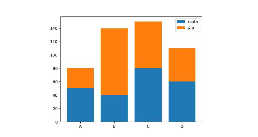
新しい列を追加できましたので、積み上げグラフを描いていきましょう。
コードは以下の順番に記述します。
- 1つ目の棒グラフを描く。
- 1つ目の棒グラフの上に2つ目の棒グラフを描く
#1つ目の棒グラフを描く
plt.bar(point['name'], point['math'], label='math')
#1つ目の棒グラフの上に2つ目の棒グラフを描く
plt.bar(point['name'], point['jap'], label='jap', bottom=point['math'])
plt.legend()

plt.show()
出力:
matplotlibで散布図を描く

散布図とは、横軸と縦軸にそれぞれ異なる軸を用意し、データが当てはまるところに点を打ったグラフです。
データの関係性を把握したいときに役立ちます。
また研究開発で用いられる測定機器の結果は、専用のソフトでしか加工できないことが多いので、測定結果を専用ソフト以外で加工したい場合にも使えます。
グラフを描画するデータを用意します。
今回はseabornライブラリにあるirisデータセットを使います。
Seaborn は、 matplotlibに基づく Python データ視覚化ライブラリです。
グラフをより見やすいデザインに加工することが可能です。
また、seabornにはサンプルデータセットが用意されています。
今回はそのデータセットの中からirisデータセットを使用します。
import seaborn as sns
iris = sns.load_dataset('iris')
iris.head()
出力:
| index | sepal_length | sepal_width | petal_length | petal_width | species |
|---|---|---|---|---|---|
| 0 | 5.1 | 3.5 | 1.4 | 0.2 | setosa |
| 1 | 4.9 | 3.0 | 1.4 | 0.2 | setosa |
| 2 | 4.7 | 3.2 | 1.3 | 0.2 | setosa |
| 3 | 4.6 | 3.1 | 1.5 | 0.2 | setosa |
| 4 | 5.0 | 3.6 | 1.4 | 0.2 | setosa |
散布図はmatplotlib.pyplot.scatter(x,y)で表示可能です。
x軸にsepal_length、y軸にsepal_widthの散布図を描きます。
plt.scatter(iris['petal_length'], iris['petal_width'])

plt.show()
出力:
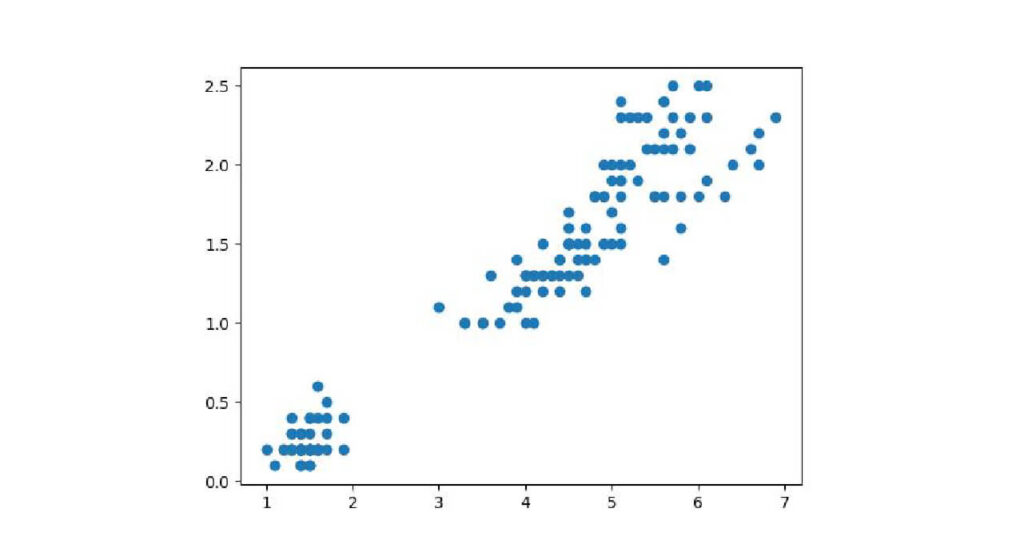
この散布図から、petal_lengthが大きいとpetal_widthも大きくなる、比例関係にあることが読み取れます。
種類ごとに色分けをする
irisデータセットは3種類のアヤメのそれぞれ50個体の花びらの長さと幅、ガクの長さと幅の4種類を測定したデータセットです。
先ほどの散布図からはどの種類の測定結果かわからなかったので、データセットを加工して可視化します。
まずは3種類のアヤメの品種名を確認します。
pandas.unique()はどのような固有値が格納されているか調べることができる関数です。
iris[‘species’].unique()でアヤメの品種名を確認できます。
iris['species'].unique()出力:
array([‘setosa’, ‘versicolor’, ‘virginica’], dtype=object)
このデータセットにはsetosa, versicolor, virginicaという3種類の品種があることがわかりました。
次にそれぞれの品種ごとにデータセットを分けてみましょう。
dataframe[detaframe[‘カラム名’] 条件]で指定したカラム内のセルで条件に合ったものを抽出することが可能です。
試しにsetosaのデータのみ抽出してみます。
setosa = iris[iris['species'] == 'setosa']
setosa['species'].unique()
出力:
array([‘setosa’], dtype=object)
setosaのデータのみ抽出できました。
同様にversicolor, virginicaのデータを抽出します。
versicolor = iris[iris['species'] == 'versicolor']
virginica = iris[iris['species'] == 'virginica']いよいよ散布図を描きます。
重ねて表示する方法は他のグラフと同じです。
違いがわかるように引数colorで色を指定してコーディングします。
plt.scatter(setosa['petal_length'], setosa['petal_width'], color = 'red')
plt.scatter(versicolor['petal_length'], versicolor['petal_width'], color='blue')
plt.scatter(virginica['petal_length'], virginica['petal_width'], color='green')

plt.show()
出力:
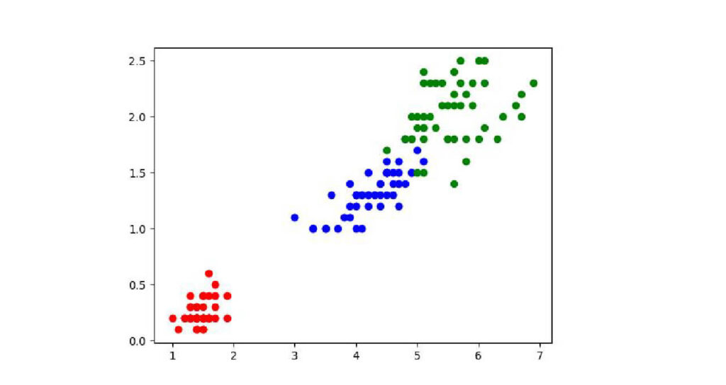
花びらの大きさはvirginica > versicolor > setosaの順で大きいことが分かりました。
ヒストグラムをmatplotlibで作成

ヒストグラムとは、データをいくつかの階級に分け、その階級に含まれるデータの数を棒グラフで表した図です。
ヒストグラムを使用することで、データの分布を視覚的に把握することができます。
そのためデータ分析において、データの特徴を把握するために用いられます。
今回もirisデータセットで試してみましょう。
データがない人はirisデータセットを読み込んでください。
iris.head()出力:
| index | sepal_length | sepal_width | petal_length | petal_width | species |
|---|---|---|---|---|---|
| 0 | 5.1 | 3.5 | 1.4 | 0.2 | setosa |
| 1 | 4.9 | 3.0 | 1.4 | 0.2 | setosa |
| 2 | 4.7 | 3.2 | 1.3 | 0.2 | setosa |
| 3 | 4.6 | 3.1 | 1.5 | 0.2 | setosa |
| 4 | 5.0 | 3.6 | 1.4 | 0.2 | setosa |
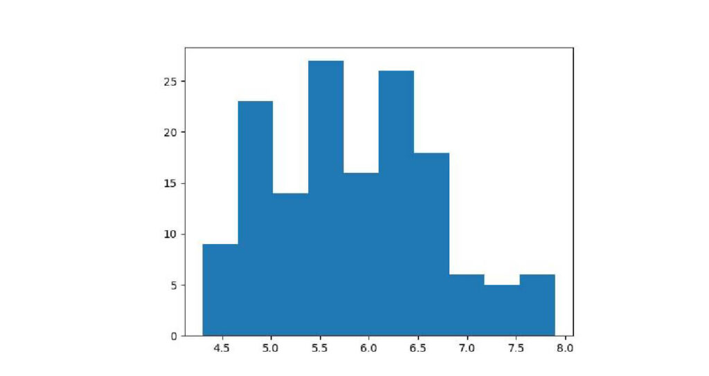
matplotlibでヒストグラムを描くには、matplotlib.pyplot.hist(データ)と記述します。
irisデータセットのspal_lengthをヒストグラムで描きます。
matplotlib.pyplotをpltと省略しているので、記述はplt.hist(iris[‘sepal_length’])です。
plt.hist(iris['sepal_length'])

plt.show()
出力:
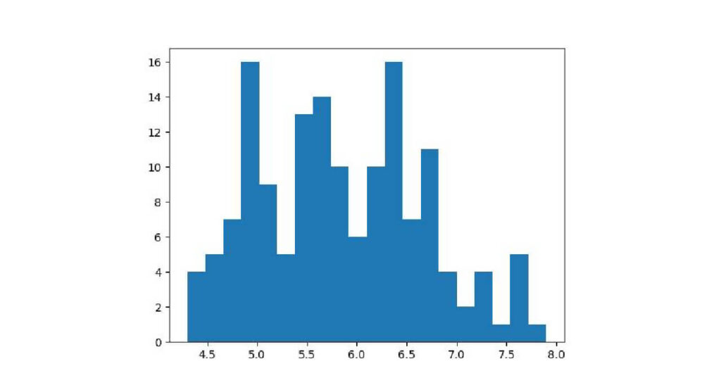
引数binsでグラフの細かさを設定
グラフを細かさを変えたい場合は、引数binsを設定します。
デフォルトは10です。
試しに引数bins=20のグラフを作成します。
plt.hist(iris['sepal_length'], bins=20)

plt.show()
出力:
matplotllibで円グラフを描く

円グラフは全体の内訳やその割合を知りたいときに使われるグラフです。
1か月の支出データを作成して円グラフの使い方を紹介します。
spend = pd.DataFrame({'項目': ['住居', '食費', '光熱費', '通信費', '娯楽費'],
                          '金額': [30000, 30000, 10000, 5000, 20000]})
spend
出力:
| index | 項目 | 金額 |
|---|---|---|
| 0 | 住居 | 30000 |
| 1 | 食費 | 30000 |
| 2 | 光熱費 | 10000 |
| 3 | 通信費 | 5000 |
| 4 | 娯楽費 | 20000 |
円グラフはmatplotlib.pyplot.pie(データ)で書くことができます。
今回はmatplotlib.pyplotをpltと省略していますので、plt.pie(データ)で実行可能です。
plt.pie(spend["金額"])

plt.show()
出力:
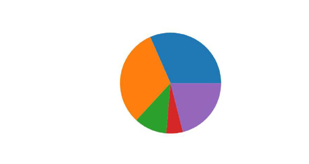
円グラフを描写できました。
しかしこの円グラフだと何を表しているのか分かりにくいので、引数を使用して見やすいグラフへ変えていきます。
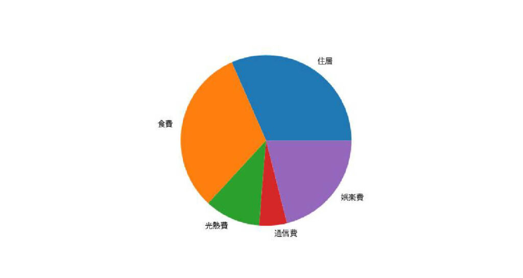
円グラフに項目を記載する
まず、各割合が何による出費なのか分かるようにします。
グラフに項目を記載するには、引数labelsを使います。
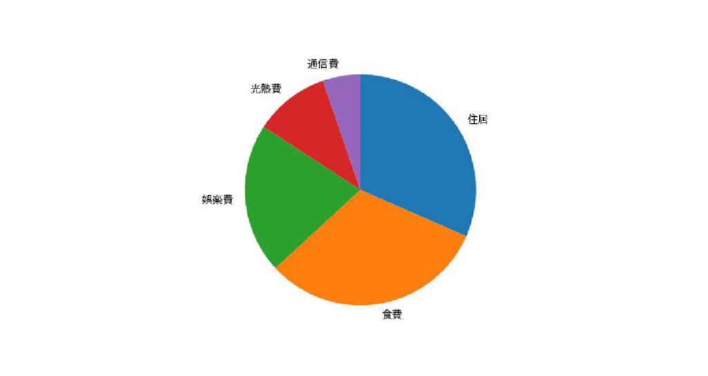
plt.pie(spend["金額"], labels=spend["項目"])

plt.show()
出力:

文字化けしていて項目がわかりません…
matplotlibの標準フォントでは日本語が対応しておらず、文字化けしてしまうのです。
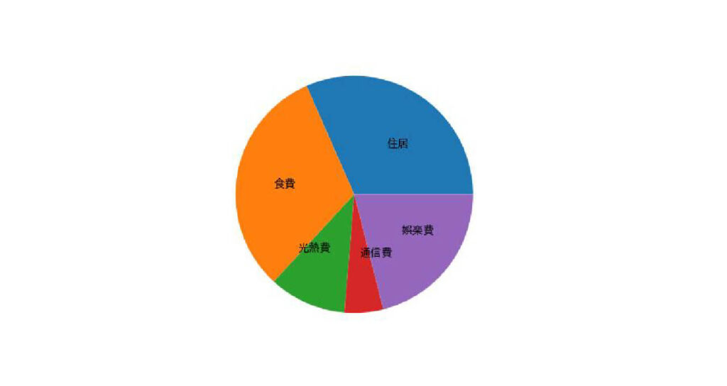
この問題を解決するために、「japanize-matplotlib」というライブラリを使います。
japanize-matplotlibはgoogleコラボラトリーに無いライブラリのため、インストールが必要です。
googleコラボラトリーでライブラリをインストールする場合、!pip install ライブラリ名 と記述してください。
!pip install japanize_matplotlibインストール後、japanize_matplotlibをインポートをします。
import japanize_matplotlibjapanize_matplotlibはインポートすることで、グラフの文字化けを自動的に修正してくれます。
それではもう一度、円グラフに項目を追加してみましょう。
plt.pie(spend["金額"], labels=spend["項目"])

plt.show()
出力:
今度は項目が文字化けせずに表示されましたね。
項目を円グラフの中に表示したい場合は、引数labeldistanceを0.5に設定します。
plt.pie(spend["金額"], labels=spend["項目"], labeldistance=0.5)

plt.show()
出力:
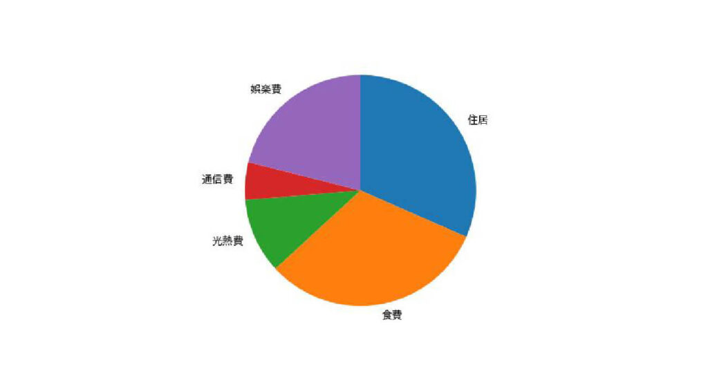
データの描写位置位置や方向を指定する
matplotlibの円グラフと普段見かける円グラフ、違いがあることに気つきましたか?
実はグラフのスタートが違います。
matplotlibの円グラフはデフォルトで、3時の位置から半時計回りにデータを描写しています。
私たちがよく見かける円グラフは12時から時計回りに描写するには、引数counterclockと引数startangleで設定が必要です。
引数counterclock=Falseで反時計回りに配置可能です。
引数startangle=90で12時スタートになります。
plt.pie(spend["金額"], labels=spend["項目"], counterclock=False, startangle=90)

plt.show()
出力:
データの順序を並べ替える
円グラフは基本的に割合の大きいものから順に並べます。
円グラフのデータの順序を並び替えるには以下の手順でおこないます。
はじめにデータフレームでデータを並べ替えます。
並べるデータの順序を揃えるには、pandas.sort関数を使います。
spend = spend.sort_values("金額", ascending=False)
spend
出力:
| index | 項目 | 金額 |
|---|---|---|
| 0 | 住居 | 30000 |
| 1 | 食費 | 30000 |
| 4 | 娯楽費 | 20000 |
| 2 | 光熱費 | 10000 |
| 3 | 通信費 | 5000 |
並び替えたデータフレームで円グラフを作成します。
plt.pie(spend["金額"], labels=spend["項目"], counterclock=False, startangle=90)

plt.show()
出力:
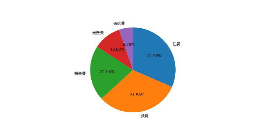
割合を記載する
円グラフに割合を記載するには、引数autopctを使用します。
指定方法は ‘%文字列’ です。 ‘%d’で整数、’%f’で少数を表示します。
‘%f’だけだと小数点以下の桁数が大きくなってしまうので、’%.1f’や’%.2f’のように桁数を指定しましょう。
%(パーセント)を表記したい場合は’%d%%’のように d や f の後ろに %% を記述してください。
plt.pie(spend["金額"], labels=spend["項目"], counterclock=False, startangle=90, autopct='%.2f%%')

plt.show()
出力:
maplotlibで箱ひげ図を描く

箱ひげ図はデータのばらつき具合を見ることができます。
一つのデータのばらつきを確認することはもちろん、複数のデータのばらつきを比較することも可能です。
ヒストグラムを紹介する際に、irisデータセットからsetosaという品種を抽出しました。
setosaデータセットを使用して箱ひげ図を作成してみましょう。
matplotlib.pyplot.boxplot(データ)で実行できます。
今回はmatplotlib.pyplotをpltと短縮してインポートしましたので、plt.boxplot()と省略可能です。
plt.boxplot(setosa['petal_length'])

plt.show()
出力:
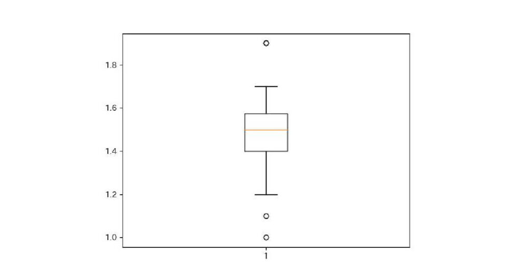
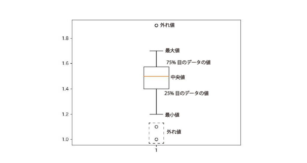
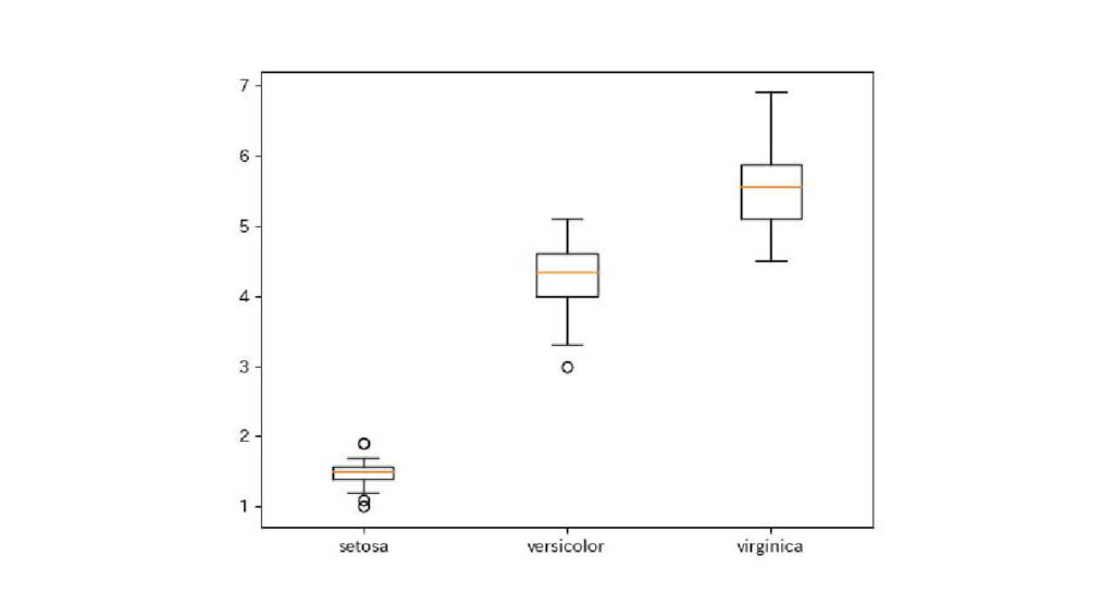
箱ひげ図はデータを大きさ順に並べた時の分布を描きます。
箱ひげ図の見方について説明します。
- 丸:外れ値
- 横棒:最小値と最大値
- 黒い四角:データの中央50%の分布
- 四角の底:25%目のデータの値
- 四角の中の赤線:中央値
- 四角の上底:75%目のデータの値
箱ひげ図でirisの品種ごとのデータ分布について確認してみましょう。
irisデータセットにはsetosaの他に、versicolorとvirginicaという品種があることを散布図を紹介する際に確認しましたね。
複数の箱ひげ図を表示するにはplt.boxplot([1つ目のデータ, 2つ目のデータ, …])と記述します。
引数labelsでどのデータがどの品種か分かるようにするのもいいですね。
plt.boxplot([setosa['petal_length'],versicolor['petal_length'],virginica['petal_length']], labels=['setosa', 'versicolor', 'virginica'])

plt.show()
出力:
バイオリン図をmatplotlibで描画

バイオリン図データの分布を可視化するグラフです。
そのため、データの偏りがどこにあるかを理解しやすいです。
matplotlib.pyplot.violinpolt(データ)で実行できます。
plt.violinplot(setosa['petal_length'])

plt.show()
出力:
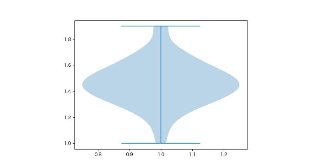
デフォルトではデータの分布と極値が表示されます。
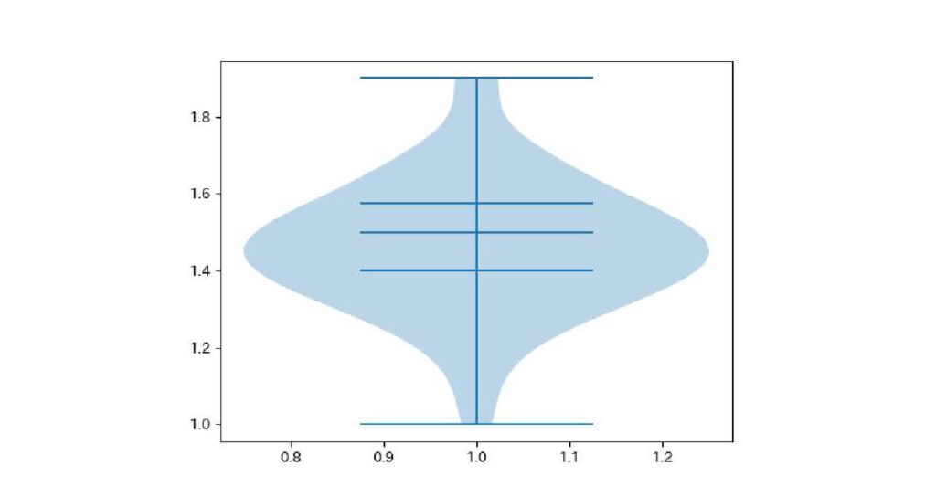
平均値を表示したい場合は引数showmeans=True、中央値を表示したい場合は引数showmedians=Trueにします。
plt.violinplot(setosa['petal_length'], showmedians=True, quantiles=[0.25, 0.75])

plt.show()
出力:
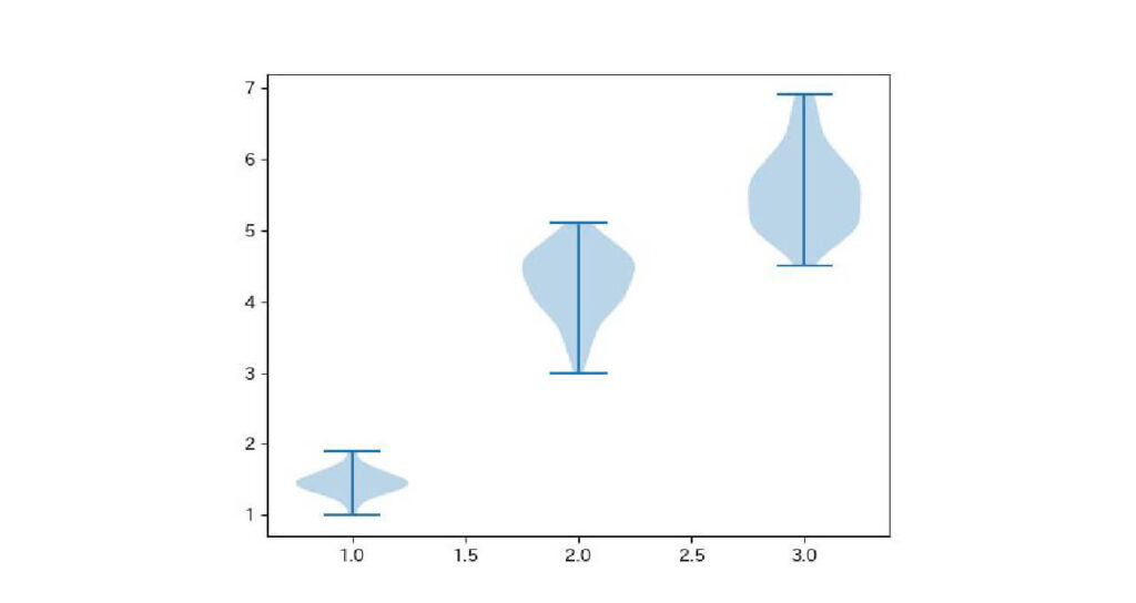
複数のバイオリン図を並べたいときは、並べたいデータを[ ]で囲みます。
plt.violinplot([setosa['petal_length'],versicolor['petal_length'],virginica['petal_length']])

plt.show()
出力:
まとめ
今回はpythonでグラフを描写できるライブラリmatplotlibを紹介しました。
データをグラフにすることで、全体を把握できたり新しいことに気づくこともあります。
データ分析の際はぜひ使ってみてください。
よくある質問
- グーグルコラボラトリーで画像が表示されません…
-
マジックコマンドを忘れていませんか?
matplotlibをインポートする時に、%matpllotlib inline と記述してください。 - 画像の日本語が表示されません…
-
ライブラリ japanize-matplotlib を使いましょう。
グーグルコラボラトリーにインストール・インポートすることで、日本語が文字化けせずに表示されます。 - pythonについてもっと勉強したいです!
-
pythonを勉強するには書籍・動画・プログラミングスクールなどがあります。特にUdemyは有料ですが、pythonを勉強できる動画がたくさんあるのでおすすめです。
合わせて読みたい


コメント